
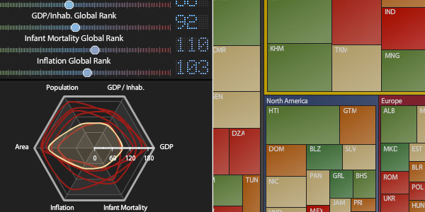
IBM's team is showing off the data rendering capabilities of Adobe Flex through an online demonstration of their World Factbook Dashboard. It's a heavily stylized application that contains various gauges, 3D column and pie charts, a radar chart, a treemap and a world map view, which are all coordinated and synced through some very smooth animated effects. The different views also allow for the dynamic, user-driven scaling of the color legend, while countries can be compared by those in their immediate neighborhood.


More here and here.
No comments:
Post a Comment